D
E
E
R
P
A
R
K
H
O
U
S
E
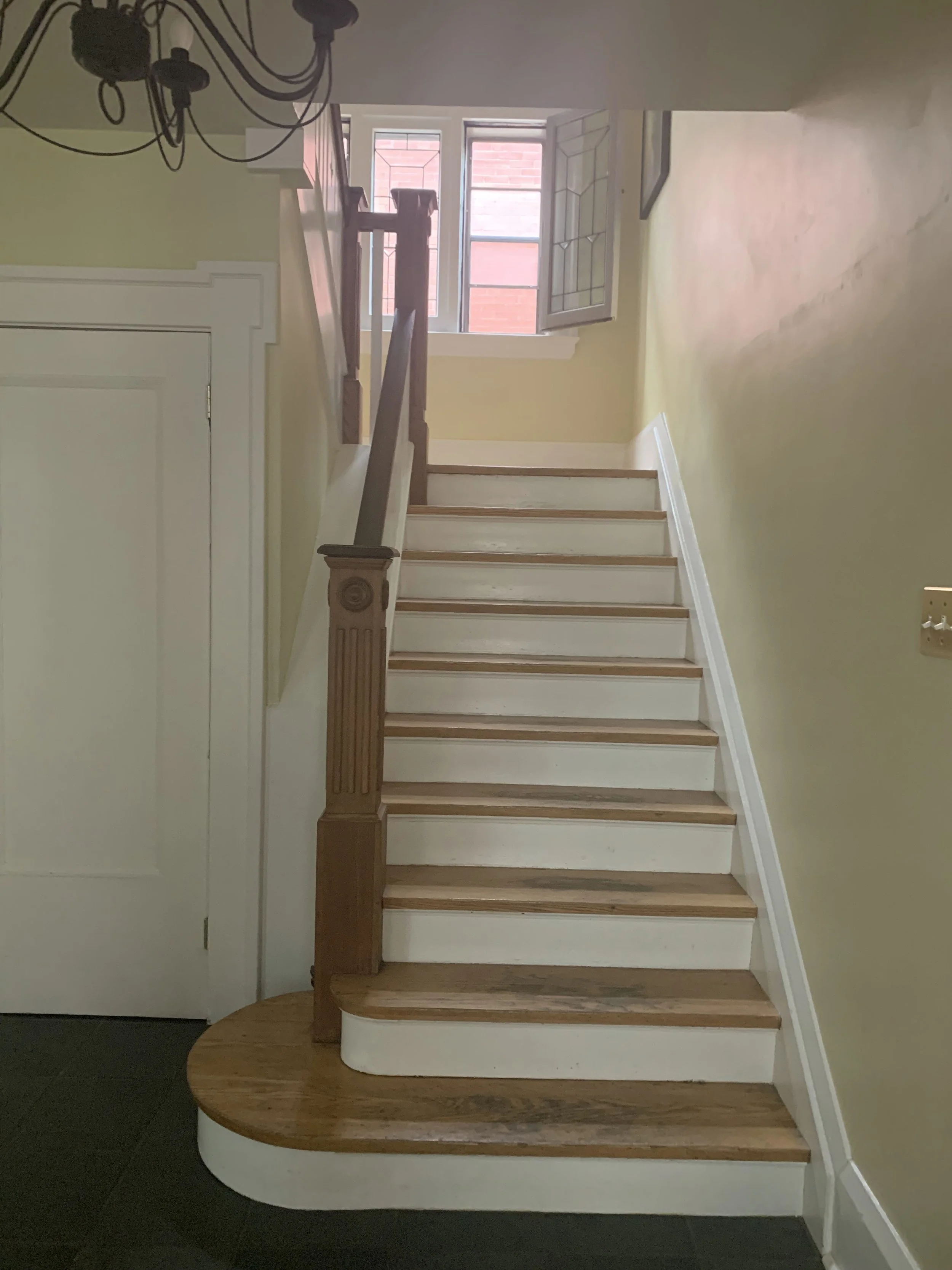
The individual rooms of the original house were preserved, articulated by the mass and texture of the Caesarstone door frames. A subtly sculpted staircase serves as a neutral space between, fluidly blending old and new.
In addition to the original transom in the entrance, the hardwired clock was also preserved and relocated, further paying homage to the house’s history.
Category: Residential
Project Year: 2019-2021
Status: Built
Client: Private
Location: Toronto, Canada
Scope: Architectural and Interior Design
Photo Credit: doublespace photography
When the clients saw the new exterior of their home for the first time, their response was exactly what we had hoped for:
“It looks like it’s always been there.”
As a century home that had been lovingly maintained by its previous owners, we wanted to approach the existing house with respect for its history and context. For the clients and ourselves, it was critical to uphold its character, ensuring that the exterior would fit within the streetscape, and that its interior would maintain its charm. At the same time, it was also critical that the space would feel decidedly contemporary, becoming a more appropriate expression of its new owners.
The main living spaces of the original house were strictly subdivided into enclosed rooms. Not only did this block a lot of natural light from reaching certain spaces -- in particular the kitchen -- but it also made the house feel far too formal for a lively family who likes to entertain. Besides this, with only one shared bathroom in the house and no space to work comfortably from home, there was a need for additional space and a revised layout.
To address these needs, the kitchen and dining space on the ground floor were completely opened up to each other and redone; the entry sequence was expanded to become more functional; and the central staircase was redesigned. On the upper levels, the previous master bedroom was converted into a shared home office, and a completely new third floor was added to contain the master bedroom, an ensuite bathroom, and a walk-in closet.
With the goal of seamlessly integrating this new third floor, we borrowed from examples found in the neighbourhood, reworking the primary roofline to make the new third floor addition appear like an enlarged dormer. The original brick facade of the first floor was stained to smoothly transition into the refinished stucco of the second floor and the new third floor above, unifying the overall volume.
For the interior, rather than forcing a completely open plan, we embraced the idea of distinct rooms. By varying materials and geometries to modulate the house’s natural lighting, these rooms were able to adopt their own moods. On the ground floor, the living and dining rooms were given a sense of intimacy by their textured lime paint ceiling; up on the new third floor, the unexpected palette of the ensuite bathroom feels like a space apart. An all-white staircase, softly lit by a new skylight, serves as a neutral space between, fluidly blending new and old.
These ideas of respecting the house’s character extend to its detailing. While the front door was replaced and pushed towards the exterior wall of the house, its original decorative transom was kept in place, marking the location of the original entrance. Similarly, the hardwired clock that remained in the previous kitchen for over 60 years was also preserved and relocated, further paying homage to the house’s history.


